Strategic logo placement is crucial for brand recognition and recall, demanding a thoughtful approach to maximize impact and ensure consistent brand messaging.
Understanding brand identity is paramount; logo placement should reflect core values and resonate with the target audience, enhancing overall brand perception.
Effective logo placement isn’t merely aesthetic—it’s a powerful tool for building brand equity and fostering lasting connections with consumers, ultimately driving success.
The Importance of Strategic Logo Placement
Strategic logo placement transcends mere aesthetics; it’s a foundational element of brand communication, directly influencing how consumers perceive and remember a brand. A well-placed logo commands attention, fostering immediate recognition and solidifying brand identity within the marketplace.
Consider the impact of center chest placement on apparel – it’s ideal for maximum visibility on structured garments like jackets and hoodies, conveying a sense of authority and prominence. Conversely, a subtle left chest placement offers a more understated, professional aesthetic. These choices aren’t arbitrary; they’re deliberate strategies.
On packaging, thoughtful placement – whether on the front, side, or top panel – guides the consumer’s eye and reinforces brand messaging. Integrating the logo with existing design elements creates a cohesive and memorable brand experience.
Furthermore, in the digital realm, adhering to UX best practices, such as positioning the logo in the top-left corner of a website, leverages established user behavior for instant brand association. Consistency across all platforms – from apparel to packaging to digital spaces – is paramount for building a strong, recognizable brand.
Understanding Brand Identity and Logo Placement
Brand identity is the cornerstone of effective logo placement; the location must authentically reflect the brand’s values, personality, and target audience. A luxury brand might favor a discreet left chest placement on apparel, conveying sophistication, while a dynamic, youthful brand might opt for a bold full back placement.
Consider how logo placement interacts with the overall design. Integrating the logo with packaging design elements, rather than simply affixing it, creates a more harmonious and memorable impression. This requires a deep understanding of the brand’s visual language.
Crucially, avoid alterations that compromise brand integrity – no shadowing, tilting, or overlays. Maintaining visibility against backgrounds is also vital; the logo must always be legible and impactful.
In the digital space, a logo in the top-left corner of a website isn’t just a convention; it’s a signal of trustworthiness and professionalism. Ultimately, successful logo placement is about strategic alignment between brand identity and visual execution.

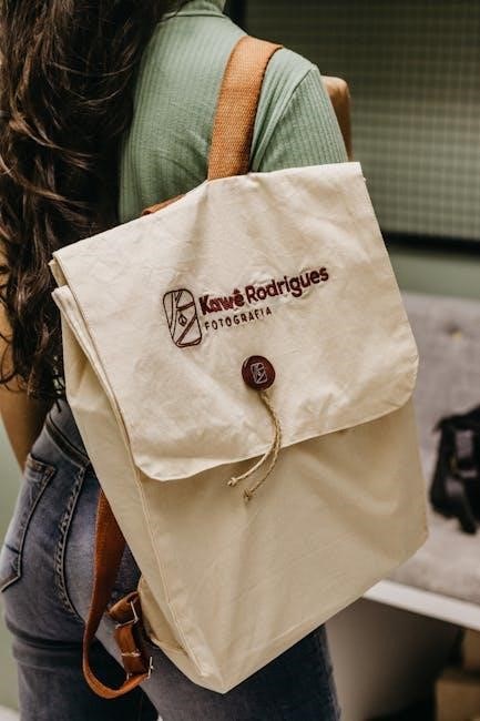
Logo Placement on Apparel
Apparel logo placement varies greatly, from classic center chest options for maximum impact to subtle left chest designs, offering versatility and brand visibility.
Center Chest Placement
Center chest placement is a bold and impactful choice, ideal for making a strong statement and commanding attention. This position, typically 5.9 inches below the collar and centered between shoulder seams, works exceptionally well on structured garments like jackets and hoodies.
It’s a particularly effective strategy when you want your logo to be the focal point of the apparel. However, consider the layering aspect; center chest logos remain visible even when worn under vests or jackets, ensuring consistent brand exposure.
For consistent results across different shirt sizes, increase placement distance by approximately 0.5 inches per size. This adjustment maintains visual balance and prevents the logo from appearing disproportionate. Careful consideration of garment style and target audience is key to maximizing the effectiveness of this placement.
Left Chest Placement
Left chest placement offers a classic and understated approach to logo visibility, often favored for corporate wear and work uniforms. This subtle positioning conveys professionalism and brand recognition without being overly assertive. It’s a practical choice, particularly when layering apparel, as it remains visible under jackets or blazers.
This placement is ideal for logos that are easily recognizable even at a smaller size. It allows for a cleaner aesthetic, avoiding a cluttered look. Consider the overall design of the garment; a well-placed logo complements the style without overpowering it.
Maintaining consistent margins and ensuring the logo’s proportions are appropriate for the chest area are crucial for a polished appearance. This placement is a versatile option suitable for a wide range of brands and industries.
Sleeve Placement
Sleeve placement presents a unique opportunity for subtle brand visibility, offering a less conventional yet effective approach to logo display. Often utilized on apparel like polo shirts and sweaters, it provides a secondary branding location without dominating the garment’s front. This placement is particularly useful for brands aiming for a more refined or understated aesthetic.
Consider the logo’s size and design; simpler logos generally work best on sleeves. Ensure the placement doesn’t interfere with the garment’s comfort or range of motion. Consistent placement across all garments is vital for maintaining brand uniformity.
Sleeve logos can complement front placements, creating a cohesive branding strategy. It’s a great option for showcasing brand details or secondary logos, adding depth to the overall design.
Back of Neck Placement

Back of neck placement is a discreet yet effective branding option, particularly popular for workwear, athletic apparel, and jackets. This location offers a subtle brand identifier that doesn’t compete with the primary design on the front or back of the garment. It’s ideal for brands seeking a refined and understated presence.
The size of the logo should be proportionate to the neck area, avoiding an overly large or intrusive appearance. Consider using a durable embroidery technique to withstand wear and tear. Consistency in placement is crucial for maintaining a professional look across all items.
This placement is often used for company names or initials, providing a clear indication of affiliation. It’s a practical choice for layering with other garments, ensuring visibility even when a jacket is worn over a shirt.
Full Back Placement
Full back placement offers a significant canvas for brand expression, making it ideal for impactful designs and larger logos. This location is commonly utilized on athletic jerseys, team apparel, and statement pieces where maximum visibility is desired. It’s a bold choice that commands attention and creates a strong brand presence.
Consider the overall design balance when utilizing full back placement; avoid overcrowding the space. High-quality printing or embroidery techniques are essential to ensure durability and a professional finish. The logo’s size should be proportionate to the back panel, allowing for clear legibility.
This placement is particularly effective for showcasing detailed graphics or slogans alongside the logo, reinforcing brand messaging. It’s a powerful tool for creating a memorable and recognizable brand identity.
Adjusting Placement for Shirt Size
Consistent logo placement across all shirt sizes is vital for maintaining a professional brand image. A logo that appears perfectly positioned on a small shirt may look awkwardly placed on a larger size, and vice versa. Therefore, adjustments are necessary to ensure visual harmony.
A general guideline is to increase placement distance by approximately 0.5 inches per shirt size. This subtle shift helps maintain the logo’s intended position relative to the wearer’s body. Precise measurements are crucial; utilize a template or digital mock-up to visualize the placement on various sizes.
Consider the shoulder seams and collar as reference points. Maintaining consistent distances from these features, adjusted for size, will yield the most professional results. Regular quality checks during production are essential to verify accurate placement.

Logo Placement on Packaging
Strategic logo placement on packaging enhances brand visibility and recognition, requiring careful consideration of panel options and integration with overall design elements.
While best practices are valuable, remember to reflect your brand’s uniqueness through creative and unconventional logo placements, fostering a memorable unboxing experience.
Experimentation is key to finding the optimal placement that maximizes impact and reinforces brand identity, ultimately influencing consumer purchasing decisions.
Front Panel Placement
Front panel placement is arguably the most impactful location for a logo on product packaging, serving as the initial point of contact for consumers and establishing immediate brand recognition.
This prime real estate demands a prominent and visually appealing logo presentation, ensuring it captures attention amidst competing products on the shelf. Consider the size and scale of the logo in relation to the overall packaging design, striving for a balanced and harmonious composition.
However, avoid overwhelming the design; the logo should complement, not dominate, the packaging. Strategic use of whitespace and complementary colors can further enhance visibility and create a sophisticated aesthetic.
Furthermore, think about the target audience and the product’s positioning. A luxury product might benefit from a minimalist logo placement, while a more playful brand could embrace a bolder and more expressive approach. Ultimately, the goal is to create a memorable and impactful first impression that resonates with potential customers.
Side Panel Placement
Side panel placement offers a valuable secondary location for logo visibility on packaging, particularly effective for reinforcing brand recognition and conveying additional information.
While not as immediately impactful as the front panel, the sides provide an opportunity to showcase the logo in a more subtle yet consistent manner, catching the eye as consumers browse the shelves. This placement is ideal for supporting brand messaging or highlighting key product features.
Consider repeating the logo alongside relevant product details or using a simplified version for a cleaner aesthetic. The side panels also allow for creative integration with the overall packaging design, potentially extending the brand’s visual narrative.
However, avoid cluttering the space; prioritize clarity and readability. Ensure the logo remains easily discernible against the background and doesn’t compete with other essential information. Strategic side panel placement can significantly enhance brand recall and influence purchasing decisions.
Top Panel Placement
Top panel placement on packaging is a prime location for establishing immediate brand recognition, serving as a crucial first impression for potential customers.
This area often captures the initial glance, making it ideal for prominently displaying the logo and core brand identifier. It’s particularly effective when combined with a concise tagline or key product benefit, quickly communicating the brand’s value proposition.
Consider the shelf environment; the top panel needs to stand out amidst competing products. Utilize contrasting colors and a clear, uncluttered design to maximize visibility. The logo should be appropriately sized and positioned to ensure it’s easily readable from a distance.
Integrating the logo seamlessly with the overall packaging design is key, creating a cohesive and visually appealing presentation. A well-executed top panel placement can significantly influence brand perception and drive purchase intent.
Bottom Panel Placement
Bottom panel placement on packaging offers a subtle yet effective opportunity to reinforce brand identity and provide essential product information.
While not as immediately impactful as the top panel, the bottom area allows for a more detailed presentation of the logo, potentially alongside supporting graphics or certifications. It’s a valuable space for including legal disclaimers, ingredient lists, or manufacturing details without cluttering the primary visual field.
Consider using the bottom panel to complement the messaging on the top panel, creating a cohesive brand narrative. A smaller, secondary logo placement here can reinforce brand recognition without overwhelming the design.
Ensure the logo remains legible and well-defined, even with the inclusion of other text or graphics. This placement is ideal for building trust and providing transparency, appealing to informed consumers.
Integrating Logo with Design Elements
Integrating the logo seamlessly with overall design elements elevates packaging beyond mere branding, creating a holistic and memorable brand experience.
Rather than simply placing the logo on the packaging, consider how it can become part of the design. This might involve using the logo’s colors to inform the palette, or incorporating its shapes into the broader graphic composition.
Experiment with unconventional placements and creative integrations, reflecting the uniqueness of your brand. Think beyond traditional layouts; a subtle, embossed logo within a pattern can be incredibly effective.
However, maintain clarity and avoid obscuring the logo. The goal is to enhance, not camouflage. A well-integrated logo feels natural and organic, strengthening brand recall and conveying a sense of sophistication.
Digital Logo Placement
Strategic digital logo placement is vital for online brand consistency, with the top-left corner of websites being a UX best practice for immediate recognition.
Ensure favicon visibility and consider social media profile logo dimensions for optimal display, reinforcing brand identity across all digital platforms.
Consistent placement builds brand recall and trust, enhancing the user experience and solidifying your online presence for lasting impact.
Website Logo Placement (Top-Left Corner)
Positioning your logo in the top-left corner of your website is a widely recognized UX best practice, rooted in established user behavior and visual hierarchy. This placement leverages the F-pattern reading style common among web users, ensuring the logo is among the first elements noticed upon landing on a page.
This strategic location creates immediate brand recognition and reinforces brand recall. It’s a convention users intuitively understand, allowing them to quickly identify the website’s origin and navigate with confidence. Consistent application of this placement across all website pages strengthens brand identity and builds trust.
However, consider responsive design; ensure the logo remains appropriately sized and visible across all devices, from large desktop screens to smaller mobile displays. Maintain sufficient padding around the logo to prevent it from feeling cramped or visually competing with other elements. A clear and prominent logo in the top-left corner is a cornerstone of effective website branding.
Social Media Profile Logo Placement

Social media platforms dictate specific dimensions and placement for profile logos, demanding adherence to their guidelines for optimal display. Typically, logos appear as small circular or square images accompanying the profile name and handle. Consistency across all social media profiles is paramount for brand recognition.
Ensure your logo is clear, legible, and easily identifiable even at small sizes. Avoid intricate details that may become lost when scaled down. A simplified version of your logo might be preferable for social media use. Maintain consistent branding by using the same logo variations and color palettes across all platforms.
Regularly review your profile logos to ensure they are displaying correctly and haven’t been distorted or cropped. A professional-looking logo contributes significantly to a positive brand image and builds trust with potential followers and customers. Prioritize clarity and consistency in this crucial digital space.
Favicon Placement and Considerations
Considerations extend beyond mere placement; the favicon should be easily identifiable at very small sizes (16×16 or 32×32 pixels). Simplicity is key – avoid intricate details that become lost when scaled down. Transparency can also enhance visual appeal, allowing the background of the browser tab to show through.
Ensure compatibility across various browsers and devices by providing multiple favicon sizes and formats (e.g., .ico, .png). A well-designed favicon reinforces brand identity and contributes to a professional online presence, improving user experience and website memorability.
General Best Practices for Logo Placement
Maintain visibility against all backgrounds, avoiding alterations like shadows, tilting, or overlays; prioritize consistent margin placement for a polished, professional brand presentation.
Maintaining Visibility Against Backgrounds
Ensuring your logo remains clearly visible against various backgrounds is paramount for effective brand recognition. A poorly contrasted logo can become lost or illegible, diminishing its impact and potentially confusing customers; Consider the color palette of potential backgrounds – both digital and physical – and choose logo colors that provide sufficient contrast.
Testing is crucial. Preview your logo on a range of colors and images to identify any visibility issues. White logos often work well on dark backgrounds, while dark logos are best suited for lighter backgrounds. Avoid placing a similarly colored logo on a similarly colored background, as this creates a blending effect.

Transparency and outlines can also be valuable tools. A transparent background allows the logo to adapt to any color, while a subtle outline can help define its shape against busy patterns. Remember that consistent visibility reinforces brand identity and ensures your message is always clearly communicated, regardless of the environment.
Avoiding Logo Alterations (Shadows, Tilting, Overlays)
Maintaining logo integrity is vital for consistent brand representation. Alterations like shadows, tilting, or excessive overlays can distort the logo’s intended appearance and dilute brand recognition. Strict adherence to brand guidelines is essential; the logo should be presented as originally designed, preserving its proportions and color scheme.
Resist the temptation to “enhance” the logo with stylistic effects. While creative experimentation is valuable, it shouldn’t compromise the core visual identity. Shadows can obscure details, tilting can appear unprofessional, and overlays can clash with the logo’s design.
Ensure visibility against backgrounds without resorting to alterations. Proper contrast and strategic placement are far more effective than adding effects. Consistent application of the unaltered logo builds trust and reinforces a strong, recognizable brand image across all platforms and materials.
Margin Placement and Consistency
Consistent margin placement around the logo is paramount for a polished and professional brand presentation. Establish clear guidelines defining the minimum clear space required around the logo on all sides, preventing visual clutter and ensuring legibility. This “breathing room” enhances the logo’s impact and prevents it from feeling cramped or overshadowed by surrounding elements.
Apply these margins uniformly across all marketing materials – from packaging and apparel to digital platforms and stationery. Inconsistency in margin placement can create a disjointed brand image, undermining brand recognition and appearing careless.
Adhering to these guidelines demonstrates attention to detail and reinforces a commitment to brand standards. Proper margin placement isn’t merely aesthetic; it’s a fundamental aspect of building a strong, cohesive, and trustworthy brand identity.